10 years after its inception, Big Health became a major player in the employer mental health space. It now had two products - one for insomnia and one for anxiety - and another for depression in the pipeline. They were responsible for creating a new health category - Digital Therapeutics - proving that effective mental health care can be delivered via your phone whilst simultaneously reducing drug spend. Their old brand identity, that reflected the engaging nature of their products, no longer suited their maturating into a major healthcare provider.
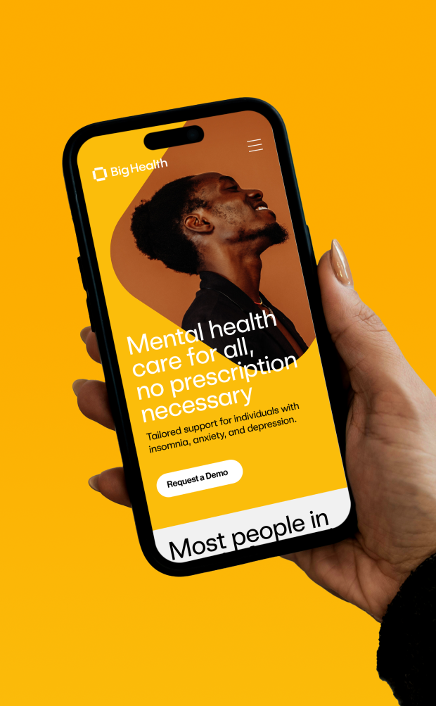
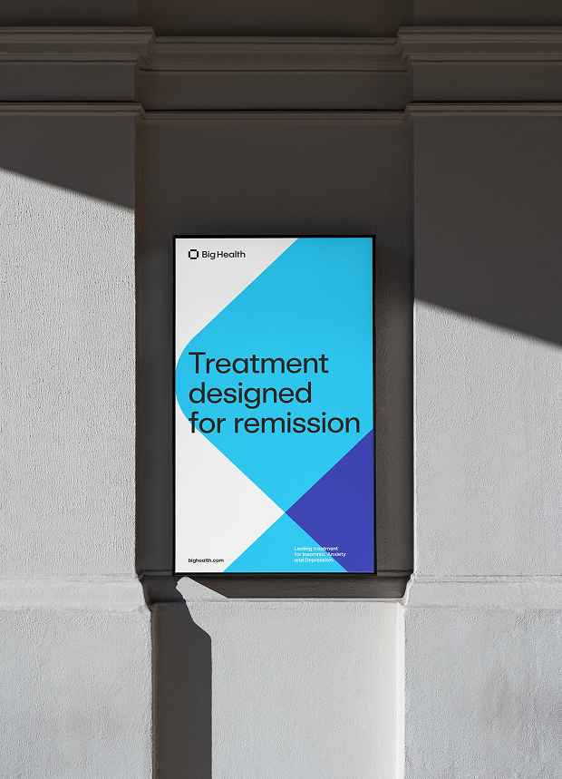
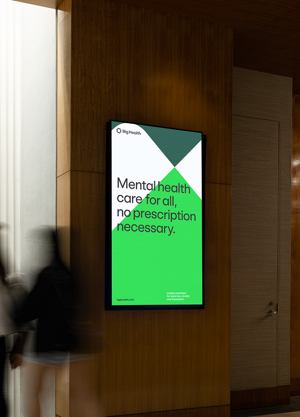
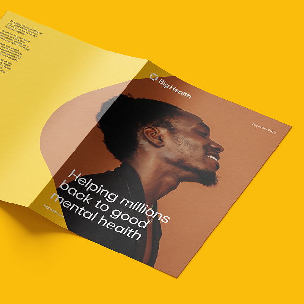
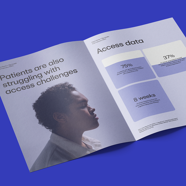
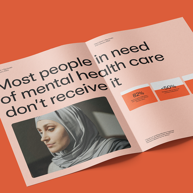
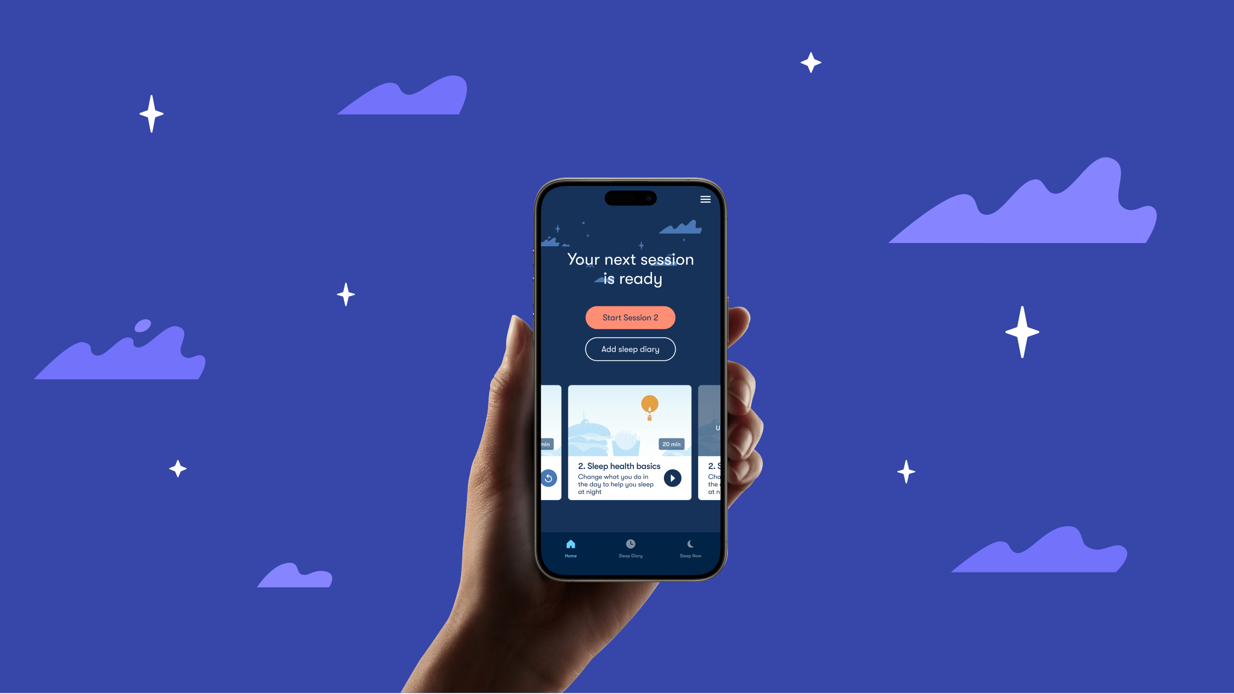
We leant strongly into the two biggest strengths of Big Health - Clinical rigour and patient focus - and this became the bedrock for the identity and the messaging. The aspirational company mission of Helping Millions Back to Good Mental Health remained with some adaptations to become condition-specific. A colour scheme was established taken from the products to enable them to talk about them and their associated conditions individually, and a bold yellow was included for moments when they need to talk more generally.
There was also a shift from illustration to photography - representing the people they help - with portraiture of folks looking to the future with hope and quiet positivity.
The change in identity helped Big Health realign their intentions both internally and externally. Externally they were seen as maturing and becoming an elder in an emerging market. Internally it helped focus the team on their reason to exist and help to hire the expertise needed to help millions.
Creative Direction
Brand Design
Product Marketing